Being the nations favourite genre of film, after action, the comedy sector seeks to bring humour, happiness, and light hearted relief to it’s audience. In my next blog I will be looking at the ways in which different typographies are used in this film genre and for what purpose, and will be using the high rated comedic films “The Mask” and “Meet The Fockers” to assist me with this analysis.
The Mask
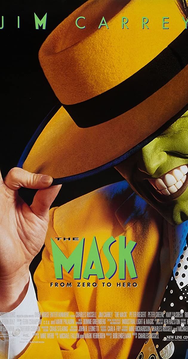
The 1994 slapstick comedy, The Mask, stars Jim Carrey, and centres around a bank employee who is able to change reality. The eccentric, quirky film uses a font that is also out of the box and unique, as seen in the example from the film poster below.


The exact typography used is called Ipkiss ZF by ZF Typography. The high contrast letters foreshadow the eccentric theme that runs throughout the film. The letters have pointed edges as opposed to straight which is usually the “norm”, therefore creating the impression to the audience that film is going to be jarring and unique too.
Meet The Fockers
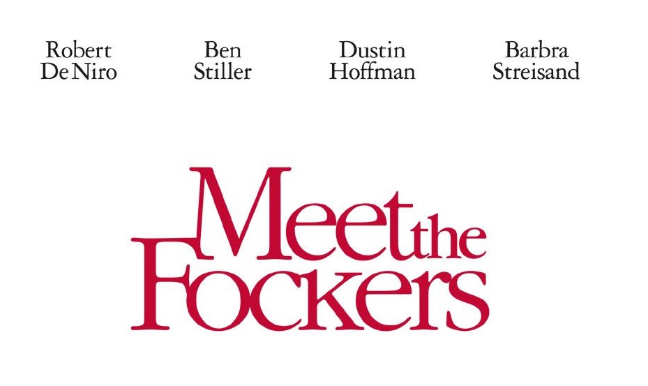
Despite being from the same genre, the Adam Sandler comedy “Meet The Fockers” uses typography in very different ways when compared to The Mask. An example of this can be seen in the film advertisement poster below.

The name for this exact type of font is called “Garamond Pro Roman”. The theme of this particular font comes across as more relaxing and enticing, due to it’s common low contrast style and wide letters. This offers the audience feelings of reassurance and familiarity, and therefore encouraging them to watch the film due to it’s subconscious feelings of relatability. Unlike The Mask, which captures it’s audiences attention through being unique and abstract, this typography appears comforting and down to earth, highlighting to the audience how the genre of the film is a fun and upbeat, family classic.
Comparison
Although both from the same genre, the movies The Mask and Meet The Fockers seek to use typography in extremely different ways. As evident in it’s poster, The Mask uses eccentric fonts to convey themes of comedy and abstractness in the film, whereas Meet The Fockers uses a very common, familiar font, which gives the audience feelings of relatability and recognition with it being a family film.
