As a University student interested in the media, television and presenting, I have always had a passion for film, whether this be the iconic classics such as Breakfast At Tiffany’s. or more modern favourites, such as Love Actually. In a time period with an ever-increasing variety of new films, bolder choices of typography’s, and stronger logo’s, it has never been more important or significant to analyse the way that these are developing over time, and the possible reasons behind this. I decided to create this blog because I wanted to make a space where different choices in films are able to be analysed in more depth, such as the specific choices in typographies, the variation in them between each genre, and how they are expanding in the present day.

https://www.townandcountrymag.com/leisure/arts-and-culture/g18753561/best-classic-movies/
https://www.theatlantic.com/entertainment/archive/2013/12/-em-love-actually-em-is-the-least-romantic-film-of-all-time/282091/
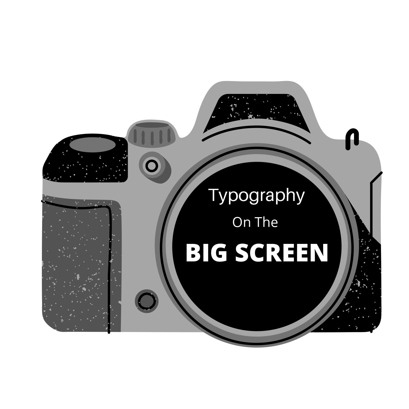
My Logo
I decided to make my logo very simple, but still capture the essence of old fashioned movies, which is where my comparison of typography begins. This can be demonstrated through my decision of choosing an old fashioned camera from the website Unsplash, and adding the simple but effective text of “Typography in Film”.
![]()
Through keeping my logo minimalistic, I am allowing the focus of my audience to be on the very essence of typography and the ways in which it is expanding and changing throughout time. The simple, minimalistic approach also coincides well with my direct yet effective banner of a camera film roll, which in turn, allows my blog to be cohesive and smooth.
My Favicon also follows the same theme as my logo, just in a more condensed, simplified version. By choosing a plain black camera I am keeping the small symbol minimalistic, while still effectively exposing to my readers the essence of what my blog is about.